
 GROWTH GUIDE
Get 2–4x Leads: 7 Block Template for Conversion Focused Service Pages
A conversion-focused service page exists to get one thing: a qualified booking, quote request, or scheduled call, and nothing else competes for attention. Every headline, image, and line of copy has to point at that single action. The rest of this guide breaks down the page architecture, form rules, and measurement steps that get you there, plus micro-templates you can adapt today.
TL;DR:
- A service page must clearly state the outcome for the buyer, demonstrate proof of capability, and address objections to maximize conversion rates.
- Essential elements include a headline naming the result, in-action hero media, and multiple strategically placed calls-to-action that reinforce the next step.
- Structuring the page into seven specific blocks—outcome, proof, process, and FAQ—mirrors the buyer’s decision process and boosts trust and clarity.
- Keep lead forms simple by asking only essential information and consider two-step forms for high-value offers to increase completion rates.
- For maximum effectiveness, test headline, CTA, and form fields first, ensure fast mobile-loading, and align ad and page messaging to lower bounce and increase qualified leads.
Table of Contents
- What Makes a Service Page Conversion Focused (Not Just a Brochure)
- What Elements Actually Move the Needle on a Service Page?
- How Should a Service Page Be Structured Start to Finish?
- What Should Your Lead Form Actually Ask For?
- Which Proof Elements Actually Reduce Buyer Hesitation?
- Is Your Page Fast and Trackable on Mobile?
- How Do You Adapt This Template by Industry?
- What Should You Test First to Improve Conversions?
- What We See Break on Most Service Pages
- Get a Page (and a Presence) Built to Convert
- Sources
- FAQ
What Makes a Service Page Conversion Focused (Not Just a Brochure)
A brochure-style page describes a business. A conversion-focused service page moves a stranger through a decision path: they recognize their problem, start wanting a fix, decide whether to trust you, and then act. Most service pages stop at “describe” and never build the trust or urgency needed to get to “act.” That gap is where leads leak out.
The difference shows up in results, not just intent. A page rebuilt around a deliberate architecture, meaning a headline that names the outcome, proof placed near the decision point, and a single repeated call to action, commonly produces a 2 to 4 times conversion lift compared to a generic “our services” page, without adding a dollar of ad spend. That’s leverage sitting on a page you already own.
Getting there means every page has to do a specific set of jobs, not just hold information. A conversion-focused service page needs to:
- State the buyer’s outcome in the headline, not your company’s capabilities
- Prove you can deliver, through testimonials, metrics, or recognizable client logos
- Explain how the service works in plain terms, without jargon
- Handle the two or three objections that stall a “yes”
- Repeat one clear call to action at least three separate times
Skip any one of these and the page still “works,” in the sense that it loads and describes the business. It just won’t convert at the rate a page built around a single next step will.
What Elements Actually Move the Needle on a Service Page?
Every high-converting service page shares the same core components, even when the design looks completely different from one industry to the next. Get these right and the rest of the page mostly takes care of itself.
1. Headline and deck
Your H1 should name the outcome the buyer wants, not the service category. “Emergency AC Repair, Same Day” beats “HVAC Services” every time, because it answers the visitor’s actual question in three seconds. Underneath, a one-line deck clarifies who the page is for: “For homeowners in need of fast, licensed repair, not a sales pitch.”
2. Hero media
Skip the stock photo of a handshake. Use imagery or a short video showing the service actually happening, a technician mid-repair, a stylist finishing a cut, a landscape crew laying sod, since service-in-action visuals read as more credible than generic staged shots. Compress the file. A hero image that adds two seconds to load time costs you conversions before the visitor even reads the headline.
3. Value proposition
Write one sentence that states what you do, for whom, and why it beats the alternative. This sentence should drive your headline, your meta description, and your form copy, so it appears in slightly different phrasing three or four times on the page without ever feeling repeated.
4. Trust stack
Two or three short testimonials, one to three recognizable client or partner logos, and a single hard metric or guarantee line beat a wall of five-star badges. Volume doesn’t build trust here; relevance does. A single testimonial from a client in the visitor’s exact situation outperforms ten generic five-star quotes.
5. CTA placement and copy
Your primary call to action needs to appear above the fold, once mid-page after your proof section, and again at the very bottom. Button copy should complete the sentence “I want to…”, so phrases like “Book Now,” “Get My Free Quote,” or “Schedule My Appointment” consistently outperform vague copy like “Submit” or “Learn More.”
6. Objection handling and micro-FAQ
Right next to your final CTA, answer the two or three questions that stall a decision, pricing, turnaround time, and service area are the usual suspects. One line each is enough. This is also where a short “this isn’t a fit if…” statement can help: openly disqualifying poor-fit visitors sounds counterintuitive, but it sharpens the signal for the buyers who are actually a match.
Pro Tip: Write your value proposition sentence first, before you touch the headline. Every other element on the page, from hero copy to button text, should trace back to that one sentence. If it doesn’t, cut it.
How Should a Service Page Be Structured Start to Finish?
Think of your page as a sequence of seven blocks, each with one job. This isn’t decoration, it’s the order that mirrors how a buyer actually decides, moving from “what is this” to “I trust this” to “let’s go.”
- H1 and deck: Name the outcome and the audience in one glance. Keep it under 12 words.
- Hero and primary CTA: Show the service in action, state the value proposition, and place your first button.
- Capability blocks: Break down what you actually do, in three to five short sections, not a bulleted feature dump.
- Proof: Testimonials, logos, and a metric, placed right after capabilities so trust follows competence.
- Offer stack: What’s included, pricing structure (even a range), and what makes this engagement different from a competitor’s.
- Process and what to expect: A simple three or four-step walkthrough of what happens after someone books.
- FAQ and final CTA: Answer lingering objections, then close with the same action you opened with.
This sequence follows the same logic behind the seven-section sales page framework that many service businesses use: outcome, mechanism, proof, offer, objection handling, then close. The order matters because it lets a visitor mentally rehearse working with you before you ever ask for their contact information.
| Block | Purpose | Target length |
|---|---|---|
| H1 and deck | Name outcome and audience | 5 to 12 words |
| Hero and CTA | Show service, first ask | 1 sentence value prop |
| Capability blocks | Explain how it works | 40 to 80 words each |
| Proof | Build trust | 2 to 3 testimonials |
| Offer stack | Clarify what’s included | 3 to 6 bullet items |
| Process | Reduce uncertainty | 3 to 4 steps |
| FAQ and CTA | Handle objections, close | 4 to 6 Q&As |
For SEO, keep a clean heading hierarchy, one H1, then H2s for each major block, so both search engines and AI answer engines can parse the structure. Format your FAQ block with FAQPage schema, which does double duty: it can earn a rich snippet in Google and makes your content easier for AI tools like ChatGPT or Perplexity to cite directly. If you offer more than three or four genuinely different services, build separate pages for each rather than cramming them into one combined catalog page, since a single unfocused page dilutes the specific outcome language each service needs.
What Should Your Lead Form Actually Ask For?
The lean-form rule is simple: ask only for what you need to make the first follow-up call or email. Every extra field is a reason for someone to abandon the form halfway through.
- Required fields: name, phone or email, and service needed
- Optional fields: address or ZIP code, preferred contact time, budget range
- Skip entirely unless legally required: birthdate, detailed project descriptions, or multiple phone numbers
Service landing pages convert better when the form is lean and the button copy is direct, so instead of “Submit,” use language tied to the actual outcome: “Book Now,” “Request My Quote,” or “Schedule Appointment.” Add one line of microcopy under the button, something like “We respond within one business hour,” to set an expectation and reduce the anxiety of hitting send.
For higher-friction offers, like a $10,000 remodel quote versus a $99 tune-up, a two-step form often outperforms a single long one. Step one asks a low-commitment question (“What service do you need?”). Step two, shown only after that click, asks for contact details. This progressive capture approach gets the visitor invested before asking for their information, which tends to lift completion rates on longer forms.
Every form submission needs to fire a tracking event, tied to a UTM-tagged source, so you know whether the lead came from organic search, a Google ad, or a referral. Route the visitor to a dedicated thank-you page after submission and fire your conversion event there. That single thank-you URL is what lets you connect a form fill back to the channel that produced it.
Pro Tip: If your form conversion rate is under 20%, count your fields before you touch your design. Most low-converting forms aren’t ugly, they’re just asking for six things when two would do.
Which Proof Elements Actually Reduce Buyer Hesitation?
Not all social proof carries equal weight. A testimonial wall with twenty quotes usually converts worse than three specific ones, because visitors skim past generic praise and stop at specifics.
The strongest testimonial structure follows a simple arc: before (the problem), action (what you did), result (a measurable outcome). “Our AC died in July with two kids home, they had a tech out in ninety minutes and it’s run perfectly since” does more work than “Great service, highly recommend.” Keep each one under 40 words so it reads in a glance.
- Choose logos and badges for relevance to your buyer, not raw volume, three recognizable local or industry logos beat ten obscure ones
- Use one hard metric per case story when you have it, “cut their energy bill by $80 a month,” rather than vague claims you can’t back up
- Place your FAQ block right next to the final CTA, and aim it at the three objections that actually stall a “yes”: pricing, timing, and fit
- Never claim a result you can’t verify. An unverifiable number does more damage to trust than no number at all
Disqualifying language deserves a mention here too. A short line like “if you need same-day service outside our area, this isn’t the right fit” can paradoxically raise conversion among the visitors who are a genuine match, because it signals honesty rather than desperation for every lead.
Is Your Page Fast and Trackable on Mobile?
Most service page traffic, especially from paid search, arrives on a phone. If the page isn’t built mobile-first, the rest of the architecture doesn’t matter.
On the UX side, put your click-to-call number in the header and repeat it in the hero, since a thumb should never have to hunt for it. Stack everything in a single column, keep CTA buttons large enough to tap without zooming, and avoid horizontal scrolling anywhere on the page.
On speed, compress your hero image or video before upload, load critical CSS first, and defer any script that isn’t required for the first paint, chat widgets, tracking pixels, and font loaders included. A page that loads in under two seconds on mobile keeps far more visitors than one that takes five.
For measurement, build this checklist into every page launch:
- Fire a conversion event on every form submission and click-to-call tap
- Set up call tracking so phone leads get attributed to the right channel
- Route form submissions to a dedicated thank-you URL and fire GA4 conversion tracking there
- Tag every campaign link with UTM parameters, and keep the naming convention consistent across channels
If your page targets paid traffic, it needs to match the ad’s exact promise, the same service, the same area, the same offer, because a mismatch between ad copy and page copy is one of the fastest ways to waste ad spend. Our quick triage checklist for Google Ads landing pages walks through a twenty to sixty minute audit for exactly this kind of misalignment.
Once tracking is wired correctly, connecting conversion rate to return on ad spend is arithmetic, not guesswork: if your page conversion rate rises from 2% to 5%, your cost per lead drops by more than half at the same ad spend, which means the same media budget now returns more than double the qualified leads.
How Do You Adapt This Template by Industry?
The seven-block architecture stays constant. What changes by industry is the hero media, the outcome language, and which objection sits closest to the CTA.
-
HVAC and home services: Swap the hero for a technician mid-repair, lead with urgency (“same-day service”) over price, and place “licensed and insured” proof right next to the CTA, since trust in a stranger entering someone’s home is the biggest hurdle.
- Micro-template: “Same-Day AC Repair, No Overtime Fees” / “Licensed technicians, straightforward pricing, no surprises.” / [Book Now] / “Fixed a failed compressor in under two hours, in August, for $180 less than the estimate we got elsewhere.”
-
Landscaping and outdoor services: Use before-and-after imagery as the hero, since visual transformation sells this category better than almost any copy could. Lead with seasonal urgency when relevant. Our landscaping lead generation guide covers seasonal messaging patterns in more depth.
- Micro-template: “Transform Your Yard Before Summer” / “Design, install, and maintain, one crew, one invoice.” / [Get My Free Quote] / “Redesigned a 2,000 square foot backyard in four days, ready for their daughter’s graduation party.”
-
Legal and professional services: Skip the action shot entirely, use a professional headshot or office photo instead, and lead with outcome certainty rather than urgency, since buyers here are managing risk, not chasing speed.
- Micro-template: “Free Consultation, Real Answers About Your Case” / “Straight talk on your options, no obligation to hire us.” / [Schedule My Consultation] / “Reviewed the settlement offer and got the client $22,000 more within three weeks.”
Decide between separate pages and a combined catalog based on how different the buyer’s search intent is: if “emergency repair” and “routine maintenance” pull in visitors with different urgency levels and different objections, split them into two pages. Our web design lead generation strategies and copywriting lead generation strategies guides both walk through this decision for content-heavy service categories.
What Should You Test First to Improve Conversions?
Not every test is worth running, and small-traffic pages can’t afford to test everything at once. Prioritize in this order: headline first, since it affects every visitor before they read anything else; CTA copy and placement second; form length third; proof placement fourth.
- Write a one-line hypothesis before you launch anything: “Changing the H1 from a service name to a stated outcome will raise form starts by at least 15%”
- If your page gets under 500 visits a month, run tests for at least three to four weeks before drawing conclusions, since small samples produce noisy results
- Track one metric per test. Testing headline and CTA copy simultaneously makes it impossible to know which change moved the number
- When a variation wins clearly, roll it into the permanent page rather than leaving it running as a permanent A/B split, that keeps your URL structure and existing backlinks intact
- Never let a design change silently break your existing GA4 event tracking. Confirm the new version still fires the same conversion event before you call the test complete
A single next step, appearing three times on the page, an insight worth repeating once here because it’s easy to lose in a redesign, is what keeps cognitive load low enough for a visitor to actually follow through.
What We See Break on Most Service Pages
Across the service pages we’ve reviewed, the same weaknesses show up again and again: a headline that describes the company instead of the outcome, a form asking for six fields when two would do, and a single CTA buried at the bottom with nothing above the fold. Fixing those three things alone tends to move the needle faster than a full redesign. If your page is underperforming, start with a one-page audit against the seven-block architecture above before you touch design or branding. Most fixes are copy and structure, not a rebuild.
Get a Page (and a Presence) Built to Convert
An alternative to piecing together a web designer, a copywriter, and a separate tracking setup for every page you launch is an AnswerReady website built around the exact architecture covered above, paired with review management, lead tracking, and AI visibility tools so the page actually gets found by Google and AI search tools alike.
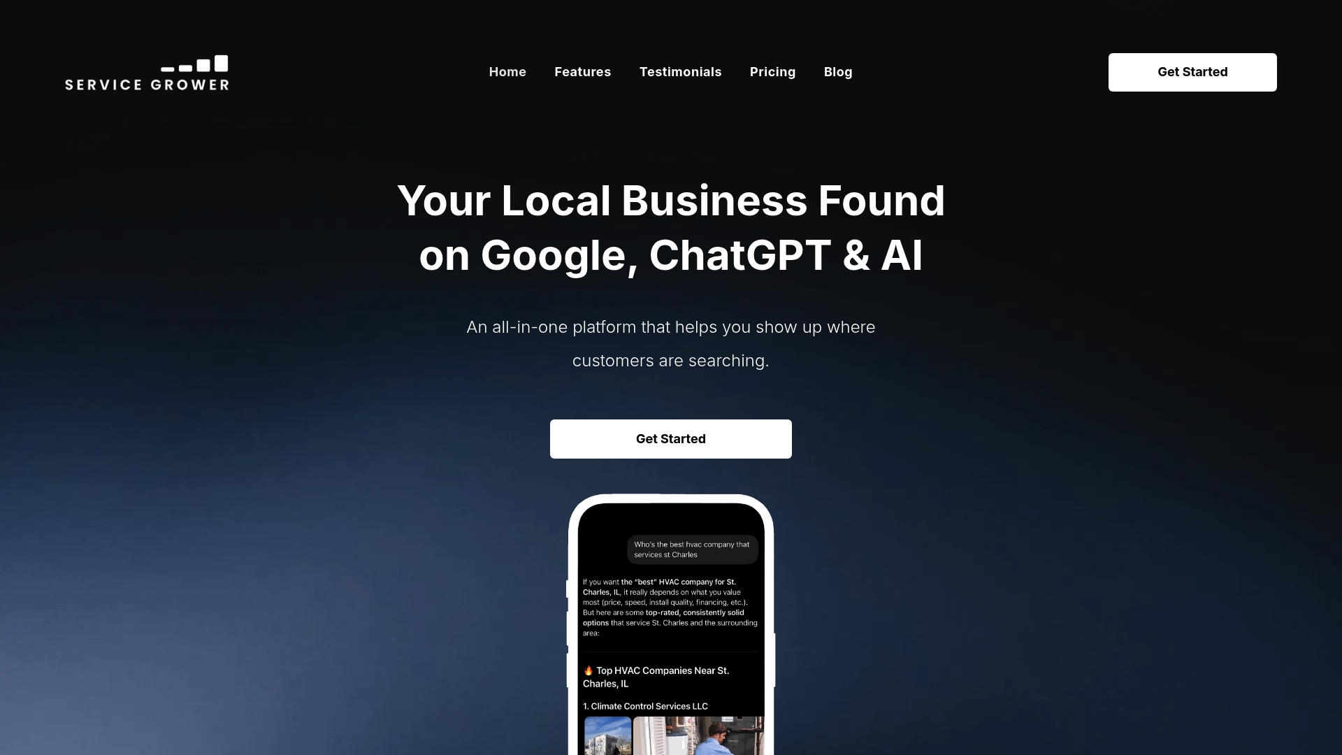
This fits best for local service businesses, HVAC companies, landscapers, salons, and similar operators, who want a done-for-you path instead of assembling their own stack. Managed Google Ads and Meta Ads and email and text follow-up services are also available to support paid traffic efforts and lead follow-up.
The Service Grower plan runs $249 per month, with managed Google Ads or Meta Ads available at $249 per month each if you want paid traffic layered on top. Check current plan details and get your page audited at Servicegrower.
Sources
- Service Page Conversion Playbook (On-Page) | TechStack
- Service business landing page guidance | Gravity Forms
- Sales Page Template for Service Businesses: The 7-Section Framework | The Founder Drop
- Landing Page Design for Local Leads & Google Ads Conversions
FAQ
What Are the Best Landing Pages for Conversions?
The best-converting service pages follow a component architecture, an outcome-focused headline, proof placed near the decision point, and one repeated CTA, that can produce a 2 to 4 times conversion lift over a generic brochure page.
What Are the Stages of a Conversion Path?
Most service buyers move through recognizing their problem, developing desire for a fix, building trust in a specific provider, and finally acting, and a conversion-focused page needs a section addressing each of those four stages.
What Is a Conversion-Focused Website?
A conversion-focused website, or a specific page within it, is built around a single visitor action, like booking a call or requesting a quote, with every headline, image, and CTA arranged to drive toward that one outcome rather than simply describing the business.
What’s a Good Conversion Rate for a Service Landing Page?
Conversion rates vary heavily by industry and traffic source, but the more useful benchmark is relative: a page rebuilt around a focused architecture typically converts 2 to 4 times better than the brochure-style page it replaced.
Do I Need a Separate Page for Each Service I Offer?
Build separate pages when your services attract visitors with meaningfully different urgency or objections, like emergency repair versus routine maintenance, and keep closely related offerings on one combined page when the buyer intent overlaps.